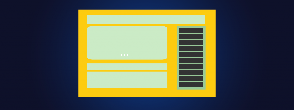
Sidebars are a very important piece of the web design puzzle. They should always be planned for adequately, and not treated as extra space to do whatever with. The content that goes into sidebar and the design involved with each piece of content can have a significant impact on how the website is used. Design consistency is a must, as well as content consistency for the most part.
A sidebar is not the main content. It is usually not for a primary means of navigation. So what is a sidebar for? A nice design filler or excess real estate on the web page? Of course not - a sidebar can have many purposes that are practical, and very usable.
A sidebar is most often for secondary content purposes. Secondary content is indeed essential to a website, even if its attention doesn't come first. Content that can help users navigate in a different way. It can highlight sections of the site that need to gain more attention to meet the goals of the site. A sidebar can be a great place to hold content that needs to be included, but shouldn't take away focus from the main content.
Where main elements should go on a website is one of the first considerations in web design. If a website needs a sidebar, where should it go - to the left or to the right? Or, should there be two sidebars, one on each side? Or perhaps two sidebars, both on either side? For many it may seem like a silly decision, but we as designers know that it can have a real impact.
Deciding on how many sidebars has an easy answer that depends on how much content is needed to be featured. If it's getting too crowded, separate it into columns. Then one can decide on where to place them. Otherwise, just go with one for simplicity. Below we'll cover the pros and cons of each option and how to best work with each situation, whether using one sidebar or two.
Pros: Left sidebars gain the most attention, and gain the attention first. They'll have higher hierarchy and content in this sidebar will be noticed before the main content. This is best for primary navigation, basic user functionality (for web apps), and so on. Categories, Post titles, and indexes and so on that would lead directly to content can help the user navigate to content quicker. Suggested topics or titles are not recommended, and should be secondary navigation.
If the list of primary navigation is extensive, there may not be a lot of room to fit it into a horizontal navigation bar. A left sidebar is good for this as it will be noticed first.
Some websites feature two sidebars, one on each side. For websites that need to hold a lot of information on each page, this approach can be beneficial. However, a negative use for this is when important and less important content is switched between the two sidebars without consideration.
To use this design pattern effectively, place primary navigation, main web application uses, and so on to the left, and additional features and secondary content to the right. If it is all one or the other, then splitting the content up on either side should be avoided. Rather, place all the content into multiple content and place to either the right or left of the content. Furthermore, content can be organized based on hierarchy where the left-most sidebar places higher than the right-most, even if they are both on either side of the main content.
What content do you want featured? A better question may be: what content benefits most from being featured? Is there a site section that is not well-known but has great potential? Or, would it be more beneficial to highlight a site section that is already very popular - making it easier for new and returning visitors to go to that site section again? A great purpose for a sidebar is to highlight content in short blurbs, lists, or images. While the primary navigation may still be available, sidebar content can act as essential navigation as well.
What goes into your sidebar? Some site owners may choose to fill it up with anything - a place for anything and everything, just like a website junk drawer. However, a sidebar can be valuable real estate on any website, and depending on what the website's purpose is, can help further reach the goals of the website.
It is important to have relevant content in your sidebars .
Elements you often find in sidebars include: search box, recent posts, social media "follow me" links, additional navigation, testimonials, sales and advertisements, social media feeds - Twitter, Pinterest, Facebook.